Email from Film Editing Pro – Don’t make these 3 [Trailer] editing mistakes!
I received this email from Film Editing Pro about a month ago, and have received permission to share it with you.
As you may or may not know, I spent the summer interning for one of the top trailer companies out there.
I spent my time earning how to do assistant editor duties.
Since that experience, I am hell-bent on becoming an assistant editor for a trailer company.
I also want to edit trailers but know I have to work on my craft a little more. Because of this email, I looked further into Chris’ Film Editing Pro online school because they have a trailer editing class that’s pretty spot on.
Jonny Elwyn did a real great write up on their course here: https://jonnyelwyn.co.uk/film-and-video-editing/how-to-edit-a-film-trailer/
As you can see from the tips below, they really know there stuff!
You can visit their training page here: https://www.filmeditingpro.com/training/
Here’s the email:
Hi there,
Today, we’re going to look at how to avoid some big (and common) trailer editing mistakes — particularly related to story-telling and graphics.
Let’s get started.
3 Common Trailer Editing Mistakes
A trailer is basically two and a half minutes of information. How much information can a person be exposed to in that amount of time and still be expected to retain any of it?
It’s a delicate balance. If you make it too sparse, the audience might write your movie off as boring or slow. Pack in too much though, and you risk them tuning out entirely.
The key is finding that sweet spot. Good trailers stay interesting but don’t actually ask the audience to remember much. Let’s look at some common mistakes or pitfalls that newer trailer editors can run into:
Common Mistakes
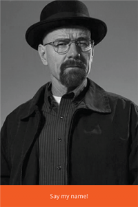
Mistake #1: Using a lot of character names

This might sound crazy. Of course we use character names, right? But if you actually pay attention while watching most trailers, you’ll realize that saying the name of a person in dialogue is actually rare.
The main character may get a call out (especially in the common scenario where the movie title is a play on their name) and of course franchise movies use lots of names (this is a special case which we’ll discuss below) but aside from that, characters are usually referred to as he, she, my son, my wife, etc.
Why is this?
The answer is simple. It’s not worth asking the audience to remember. Let’s be honest, the character names probably don’t really matter that much to the story of the trailer. If the audience is thrown a ton of specifics they are likely to forget them anyway. And even if we do use a bunch of character names, how do we know if the audience has retained them?
Will they know who Sarah is as opposed to Julie or Stephanie? If we assume they do, and they don’t, what sort of confusion might this cause? Keeping it simple, and avoiding names whenever possible, is the much safer course of action.
Mistake #2: Graphic Cards With Too Much Text
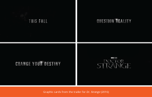
A lot of trailers have what’s called a “copy message”. This is often a statement which speaks to the theme of the movie. Here’s an example:

Let’s note a couple of things.
1. Each card stands alone
You don’t need to connect them together. They work together, but they don’t require holding each one in your head in order to make sense of them all as a whole.
2. Each phrase is very short
No more than 3 words per “card”. The professionals know that if the graphic has even a few more words then they’ll start running into problems. The more words there are, the longer you have to leave the card on screen. This can easily wreck the rhythm of your trailer.
But more importantly, if there are too many words on any given graphic, the audience simply won’t read them. They’ve been trained by years of tv commercials and movie promos that the text is only going to be on screen for a very short amount of time.
As a result, if they see a card that has more than 5 words, they won’t even attempt to decipher it. And even if they do try, it’s often going to be to the detriment of the next thing they see or hear during the trailer. They’ll still be thinking about that long list of text they were just shown.
This can create a domino effect that leads to confusion as they miss important story beats that contextualize other parts of the narrative later on. Remember, we need to be cautious about giving the audience too much information, thus overstimulating them to the point that they tune out.
This is one reason why “copy” (this is what we call the message of the text or narrator) is very often a play on words. A slight variation on an existing idiom. The copy writer is attempting to capitalize on knowledge the viewer already has. Effectively piggybacking on mental real estate that already exists.
Here’s a good analog:
What’s easier to remember, a random 11 digit code or your own phone number with a “2” added to the end?
One last little insider secret regarding graphics cards such as these:
Their main function isn’t even always the message they contain. They’re often more important as a tool to break up the story and allow easy transition to different parts of the movie quickly.
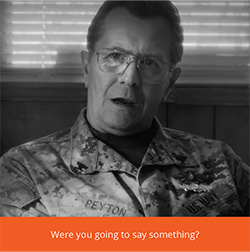
Mistake #3: Lip Flap
This is when the editor makes the decision to use a shot where a character’s mouth is moving but the audience isn’t also given the matching dialogue or sound.

Besides the fact that it looks sloppy, it also leads to a lot of audience confusion. What happened to the sound for that moment? Was it there and I didn’t hear it? Or was I supposed to not hear it? Even if I’m not meant to hear it, I still can’t help but thinking, what did that person say?
And right there they’ve missed the next 10-15 seconds of your trailer. And now they’re confused for the rest of the time because they’ve missed information and there’s no way for them to catch back up. Sometimes it’s painful, the shot may be beautifully lit or framed, but if you have lip flap you simply cannot use it.
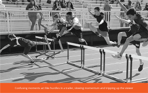
Watching a trailer is kind of like being a hurdler. Each piece of information is something the audience has to jump over (understand/digest). If they trip on even one thing, it can start a chain reaction where they never complete the race.
Keep those hurdles as simple and easy to clear as possible.

Thanks for reading! Have a wonderful week, all.
- Chris
P.S. As always, please let me know your requests and suggestions for additional content. Are there any editing topics you’d like us to discuss? Any specific problems you could use help with? Let me know!